“display”属性
- block:块级元素
- inline:行内元素
- none
block:
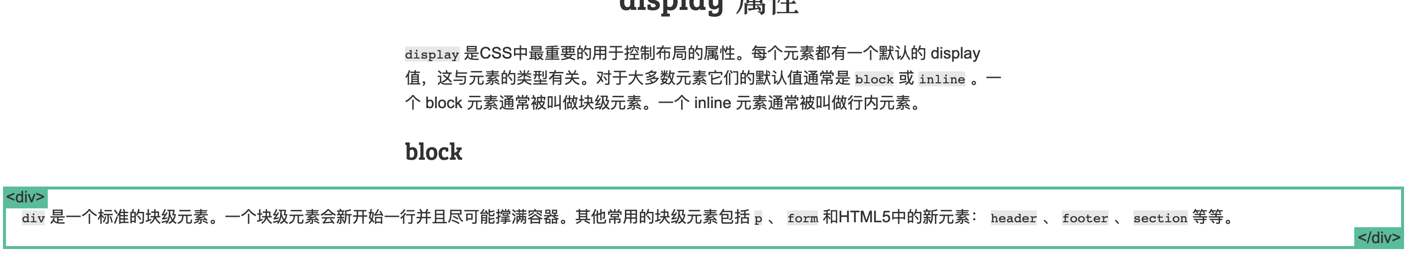
div是一个标准的块级元素。- 一个块级元素会新开始一行并且尽可能撑满容器。
- 其他常用的块级元素包括
p、form和HTML5中的新元素:header、footer、section等等。
inline:
span是一个标准的行内元素。- 一个行内元素可以在段落中
<span> 像这样 </span>包裹一些文字而不会打乱段落的布局。 -
a元素是最常用的行内元素,它可以被用作链接。
none:
- 一些特殊元素的默认 display 值是它,例如 script 。
- display:none 通常被 JavaScript 用来在不删除元素的情况下隐藏或显示元素。
- 它和 visibility 属性不一样。把 display 设置成 none 元素不会占据它本来应该显示的空间,但是设置成 visibility: hidden; 还会占据空间。
margin: auto;
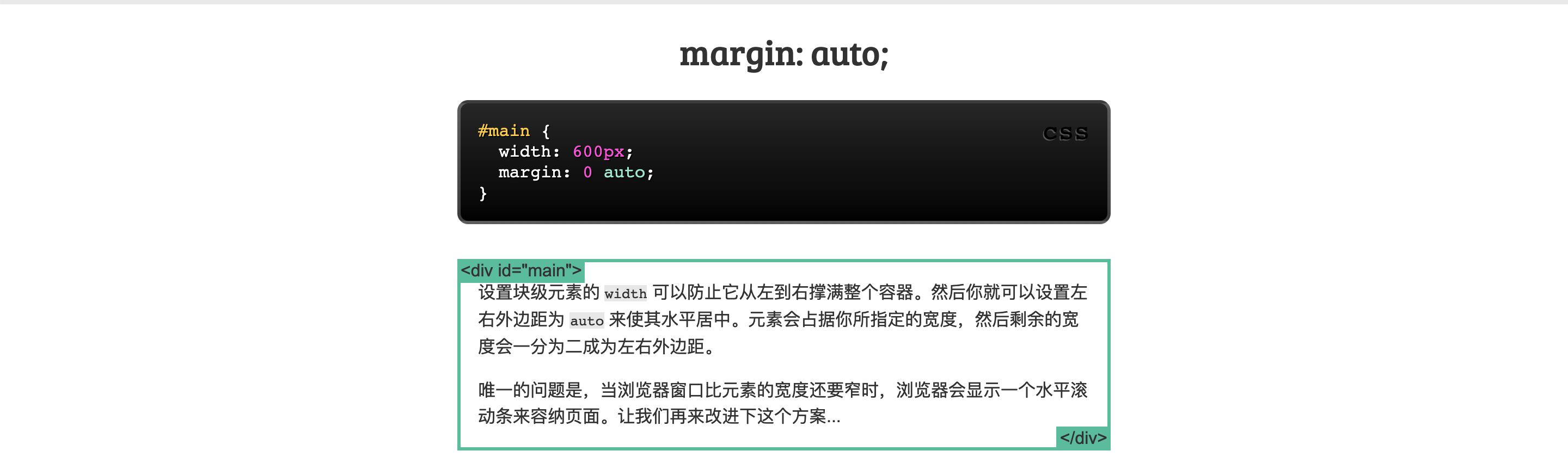
1 | #main { |
- 设置块级元素的
width可以防止它从左到右撑满整个容器。然后你就可以设置左右外边距为auto来使其水平居中。元素会占据你所指定的宽度,然后剩余的宽度(浏览器宽度-width)会一分为二成为左右外边距。 - 唯一的问题是,当浏览器窗口比元素的宽度还要窄时,浏览器会显示一个水平滚动条来容纳页面。
当当浏览器窗口比元素的宽度还要窄时,浏览器会显示一个水平滚动条来容纳页面:
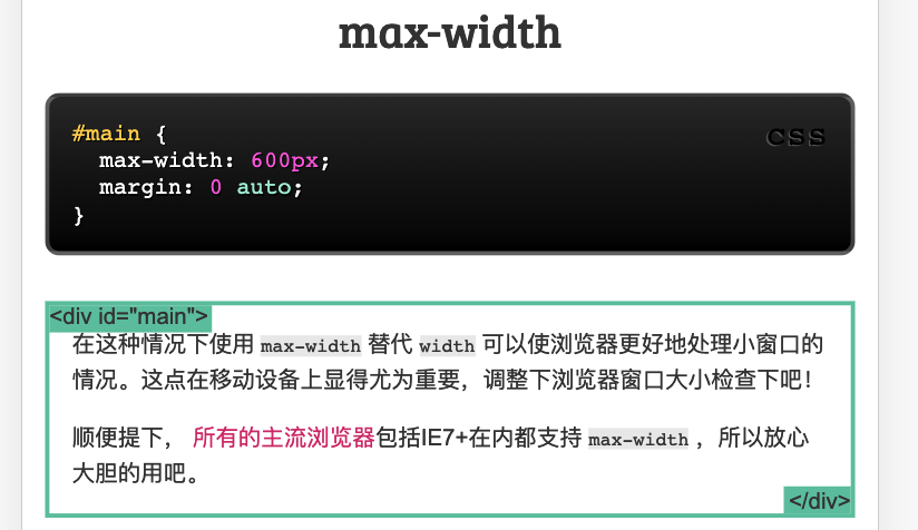
max-width
1 | #main { |
- 在这种情况下使用
max-width替代width可以使浏览器更好地处理小窗口的情况。这点在移动设备上显得尤为重要,调整下浏览器窗口大小检查下吧! - 顺便提下, 所有的主流浏览器包括IE7+在内都支持
max-width,所以放心大胆的用吧。
盒模型
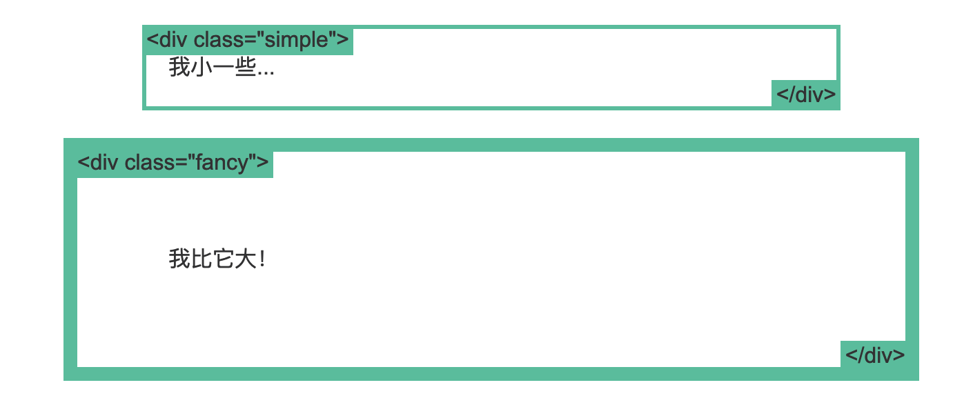
- 在我们讨论宽度的时候,我们应该讲下与它相关的另外一个重点知识:盒模型。
- 当你设置了元素的宽度,实际展现的元素却超出你的设置:这是因为元素的边框和内边距会撑开元素。
- 看下面的例子,两个相同宽度的元素显示的实际宽度却不一样。
1 | .simple { |
box-sizing
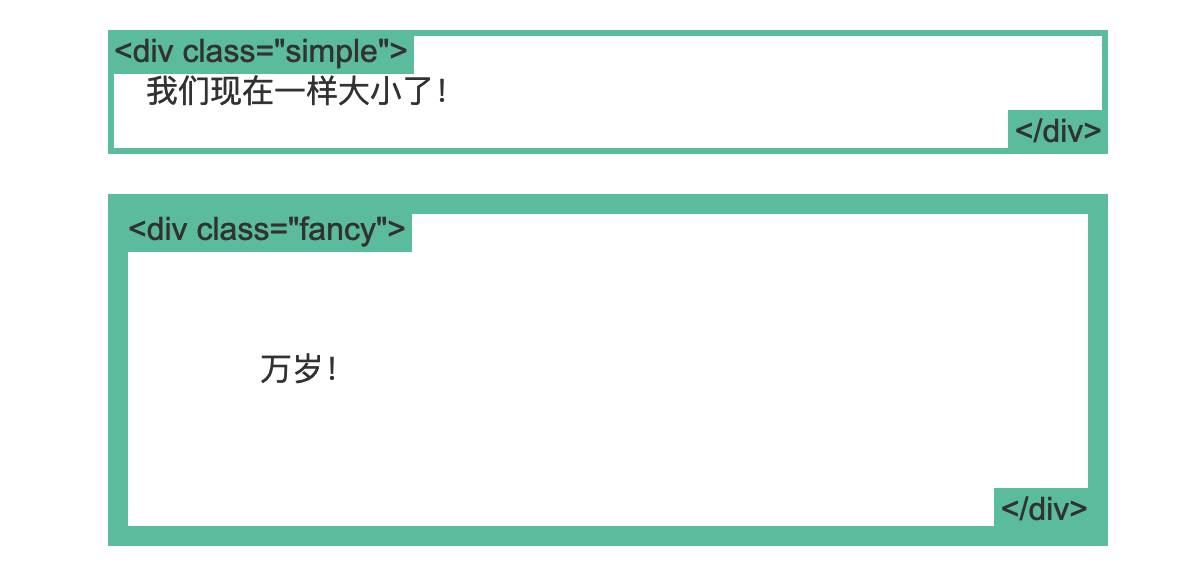
- 人们慢慢的意识到传统的盒子模型不直接,所以他们新增了一个叫做
box-sizing的CSS属性。 - 当你设置一个元素为
box-sizing: border-box;时,此元素的内边距和边框不再会增加它的宽度。这里有一个与前一页相同的例子,唯一的区别是两个元素都设置了box-sizing: border-box;:
1 | .simple { |
既然没有比这更好的方法,一些CSS开发者想要页面上所有的元素都有如此表现。所以开发者们把以下CSS代码放在他们页面上:
1 | * { |
这样可以确保所有的元素都会用这种更直观的方式排版。
不过 box-sizing 是个很新的属性,目前你还应该像我上面例子中那样使用 -webkit- 和 -moz- 前缀。这可以启用特定浏览器实验中的特性。同时记住它是支持IE8+的。
position
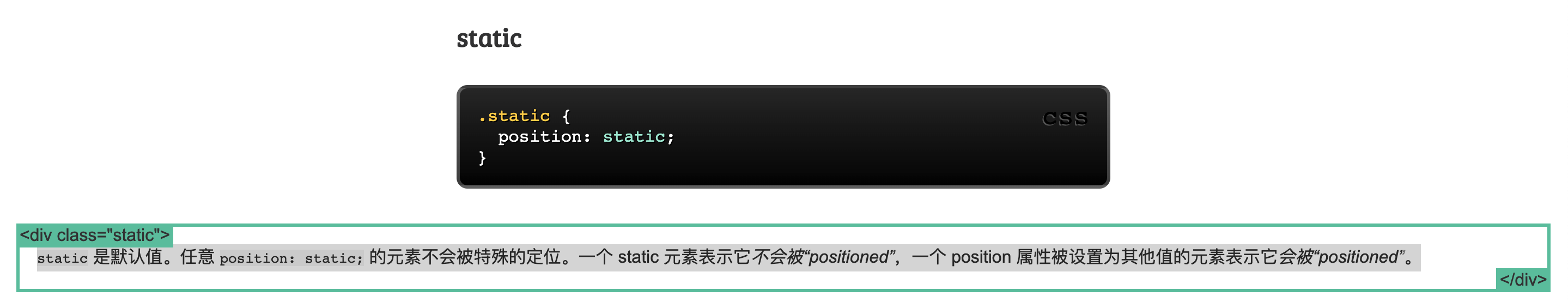
static
static 是默认值。任意 position: static; 的元素不会被特殊的定位。一个 static 元素表示它不会被“positioned”,一个 position 属性被设置为其他值的元素表示它会被“positioned”。
1 | .static { |
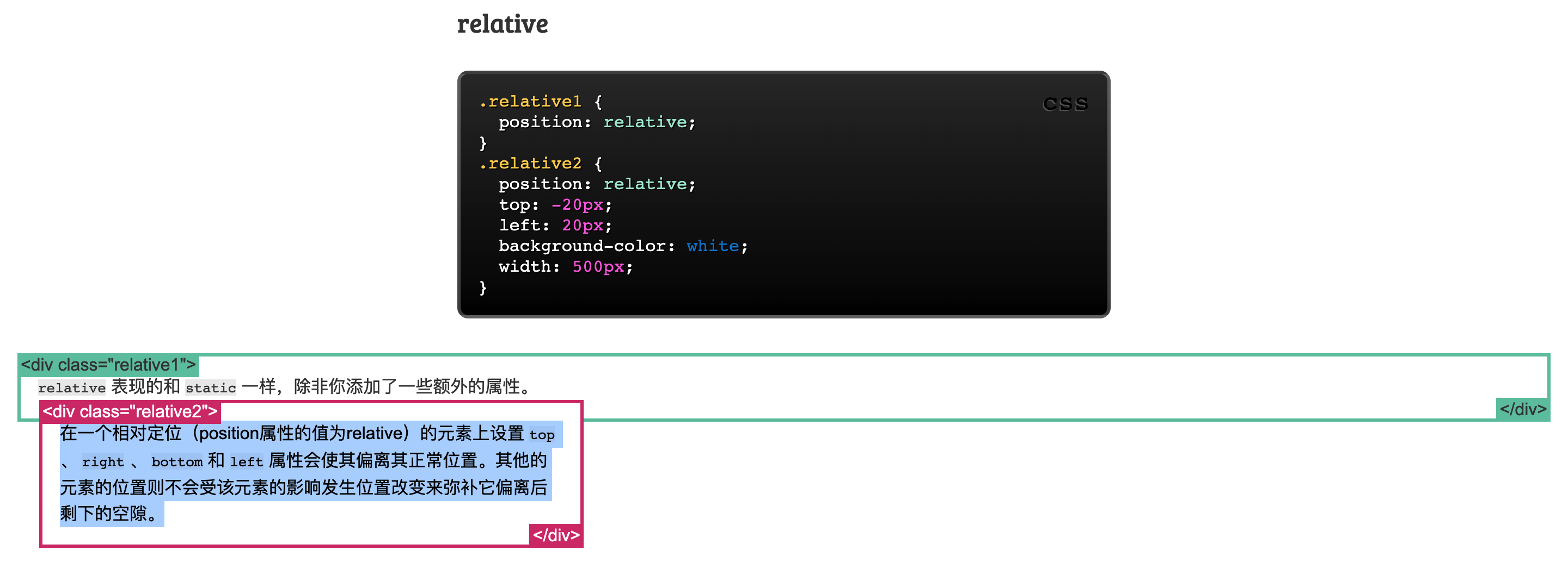
relative
relative表现的和static一样,除非你添加了一些额外的属性。- 在一个相对定位(position属性的值为relative)的元素上设置
top、right、bottom和left属性会使其偏离其正常位置。其他的元素的位置则不会受该元素的影响发生位置改变来弥补它偏离后剩下的空隙。
1 | .relative1 { |
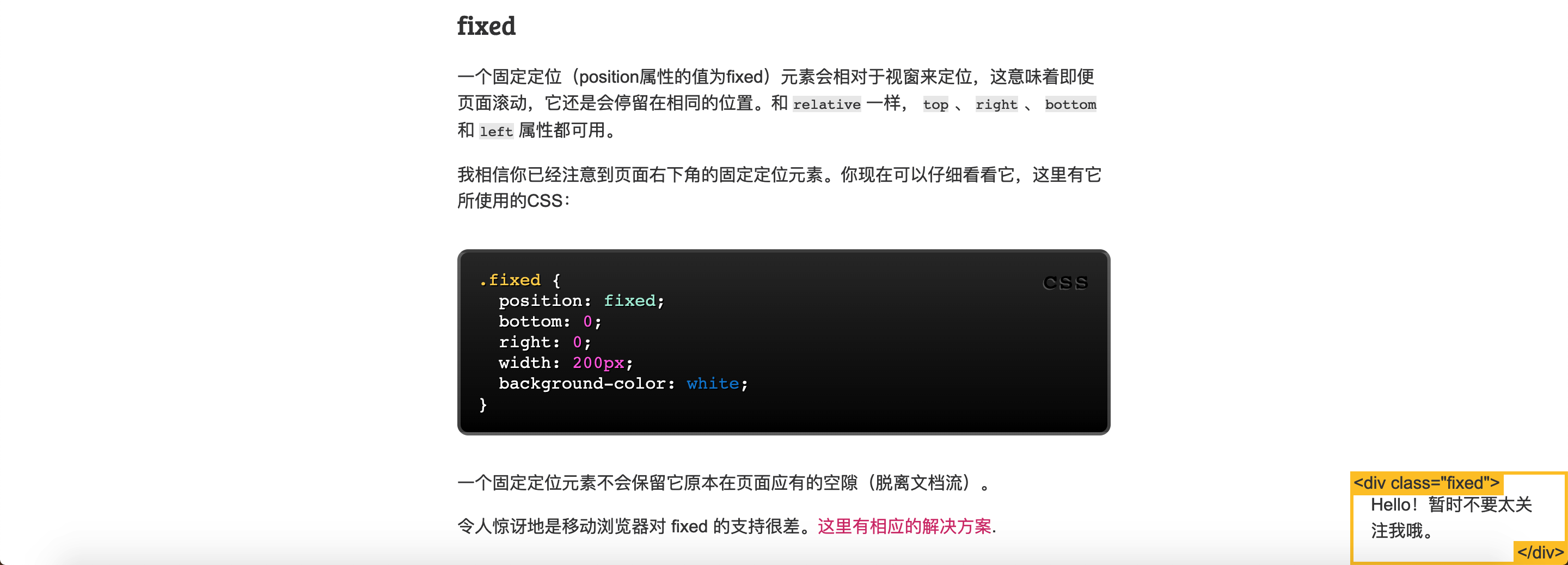
fixed
- 一个固定定位(position属性的值为fixed)元素会相对于视窗来定位,这意味着即便页面滚动,它还是会停留在相同的位置。
- 和
relative一样,top、right、bottom和left属性都可用。 - 一个固定定位元素不会保留它原本在页面应有的空隙(脱离文档流)。
我相信你已经注意到页面右下角的固定定位元素。你现在可以仔细看看它,这里有它所使用的CSS:
1 | .fixed { |
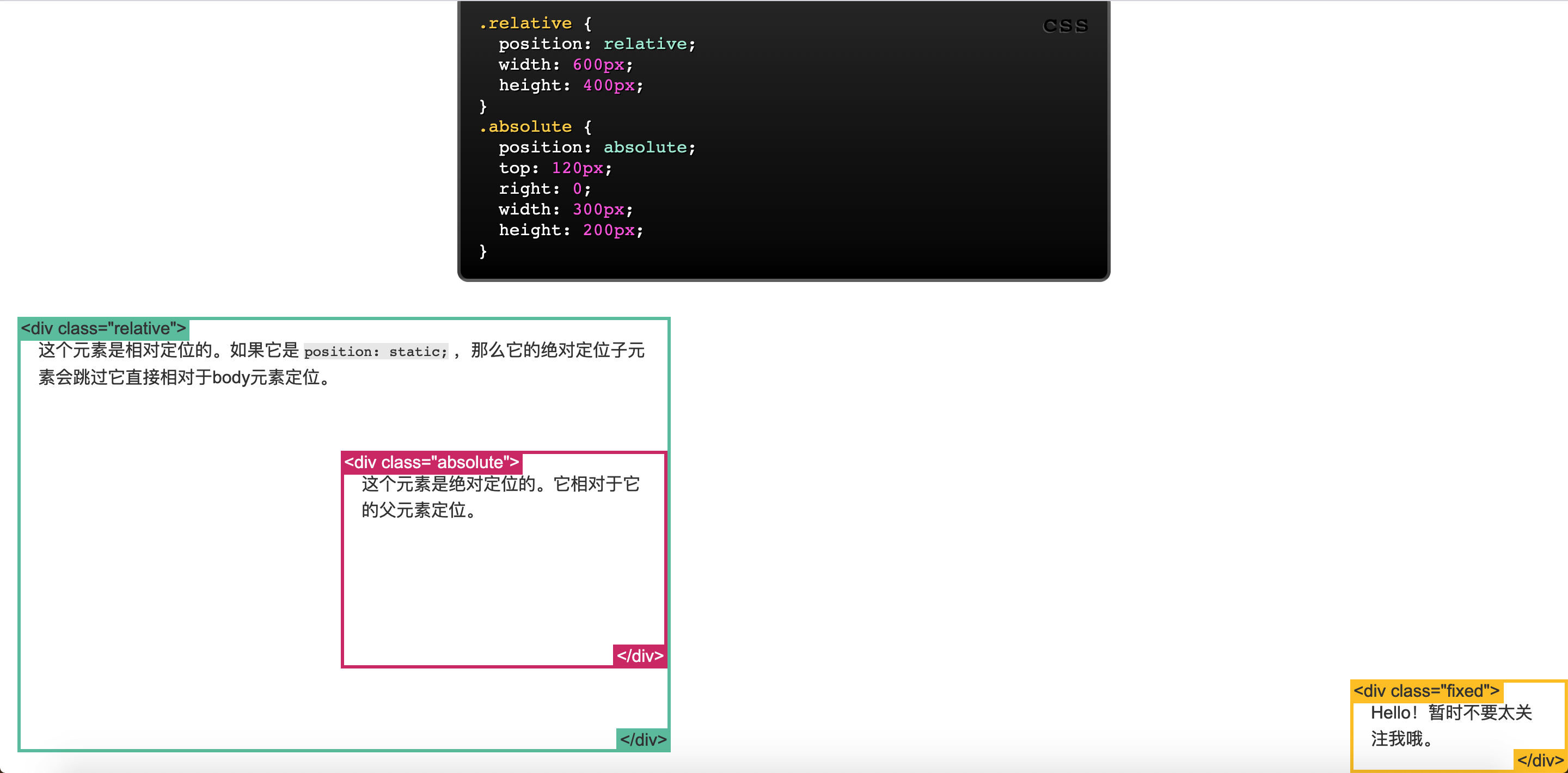
absolute
absolute是最棘手的position值。-
absolute与fixed的表现类似,但是它不是相对于视窗而是相对于最近的“positioned”祖先元素。 - 如果绝对定位(position属性的值为absolute)的元素没有“positioned”祖先元素,那么它是相对于文档的 body 元素,并且它会随着页面滚动而移动。记住一个“positioned”元素是指 position 值不是
static的元素。
1 | .relative { |
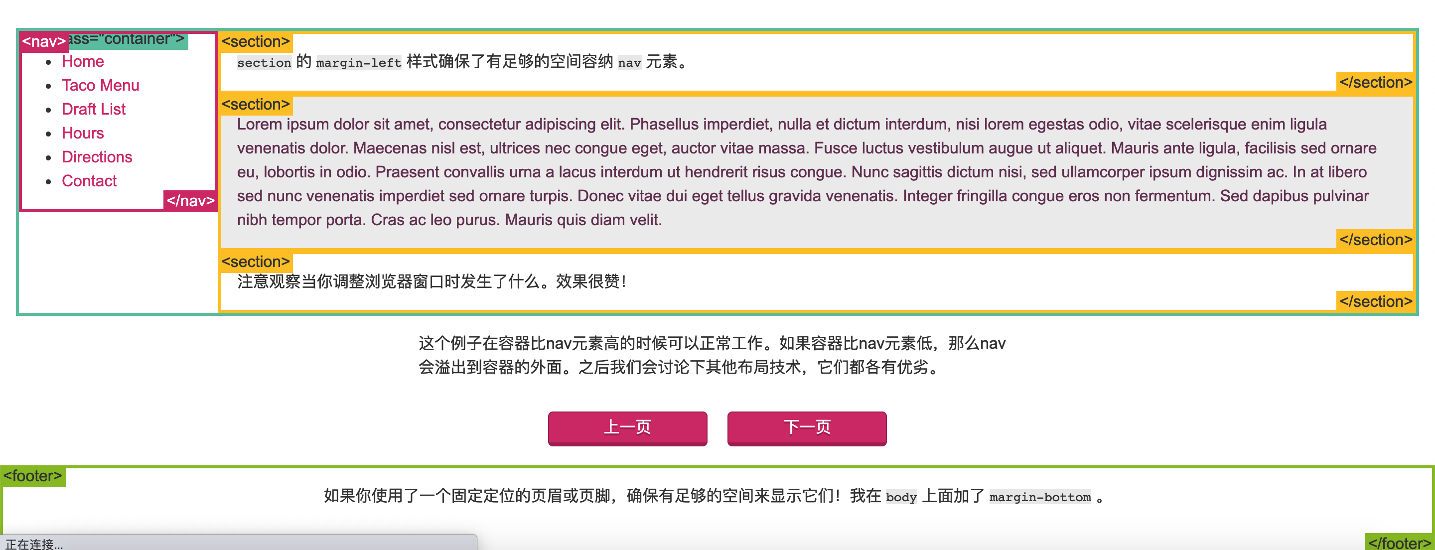
position例子
1 | .container { |
float
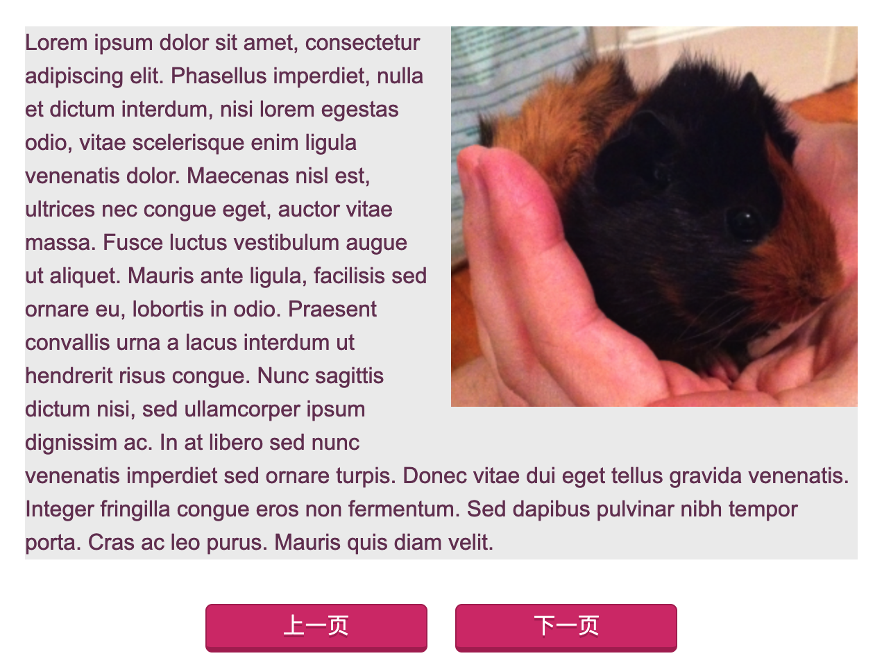
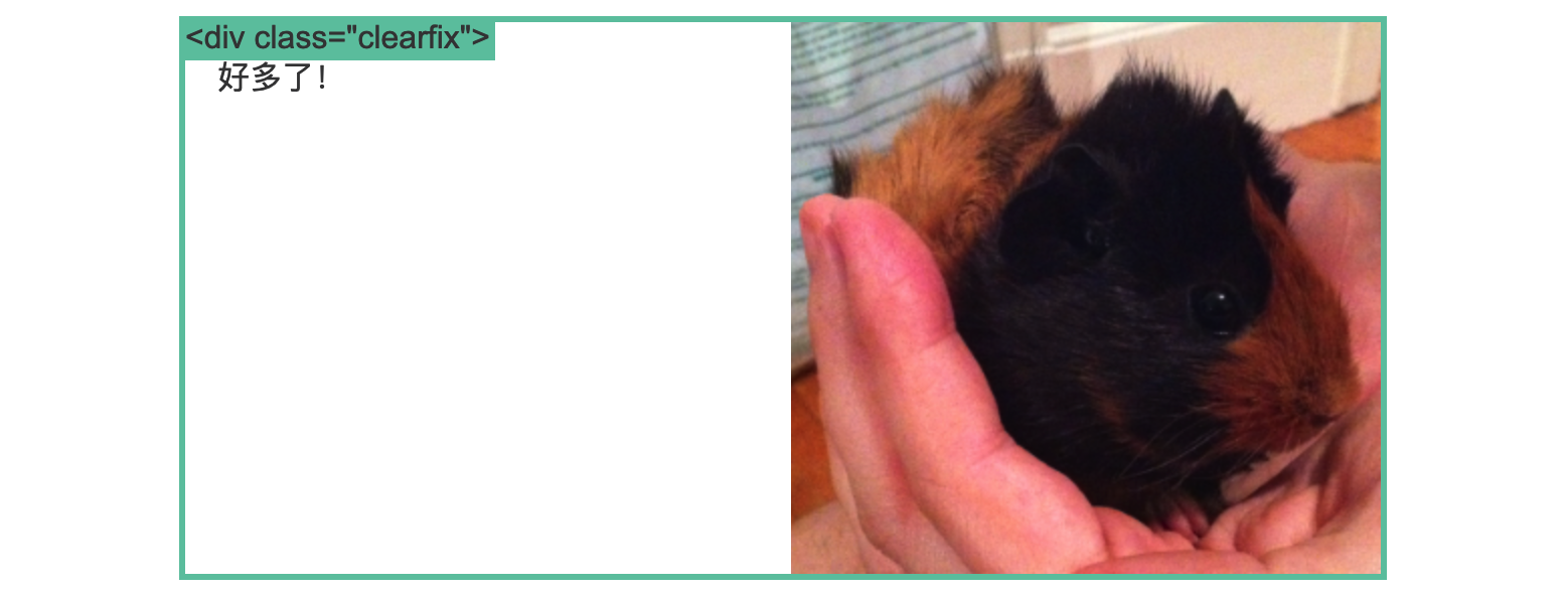
Float 可用于实现文字环绕图片
1 | img { |
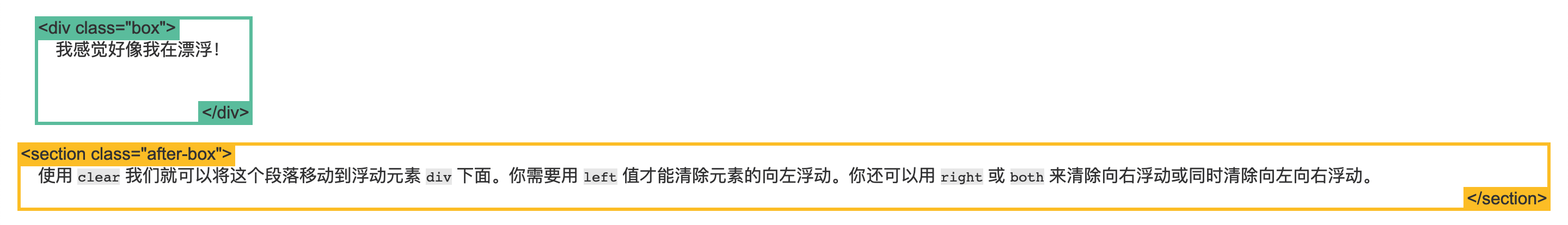
clear
clear 属性被用于控制浮动。
1 | <div class="box">...</div> |
1 | .box { |
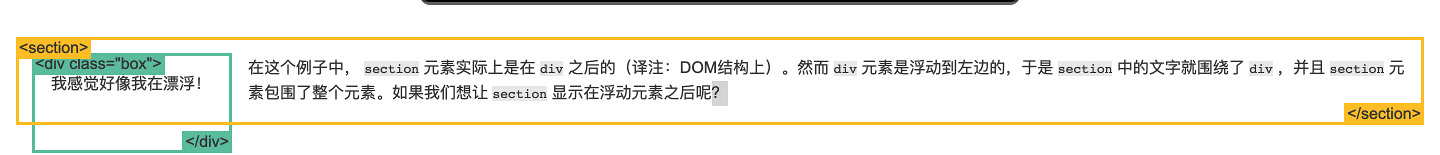
1 | .box { |
清除浮动(clearfix hack)
在使用浮动的时候经常会遇到一个古怪的事情:
1 | img { |
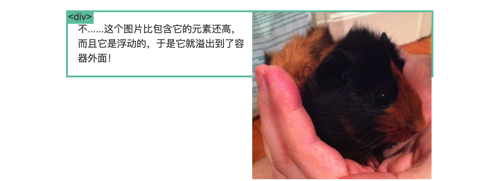
见证奇迹的时刻到了!有一种比较丑陋的方法可以解决这个问题,它叫做清除浮动(clearfix hack).
让我们加入一些新的CSS样式:
1 | .clearfix { |
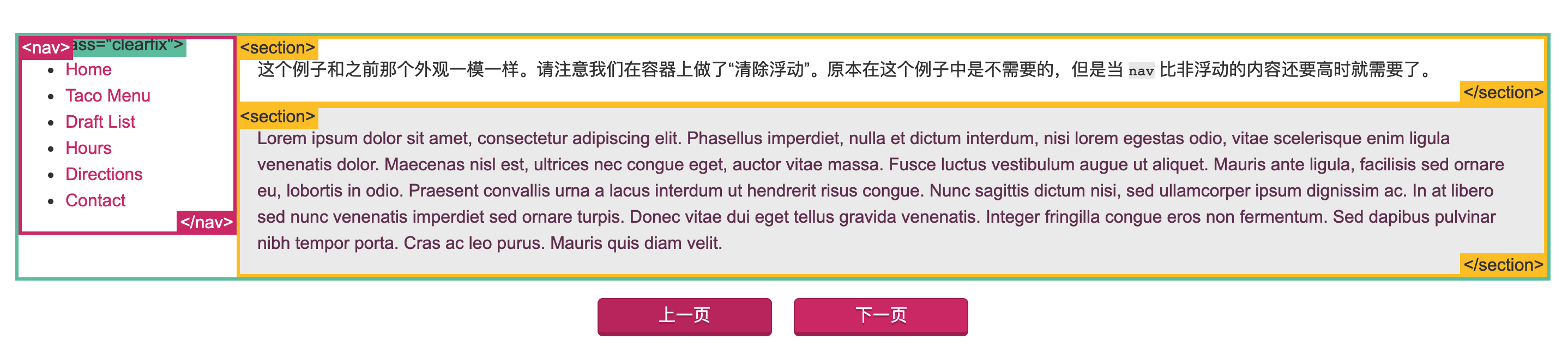
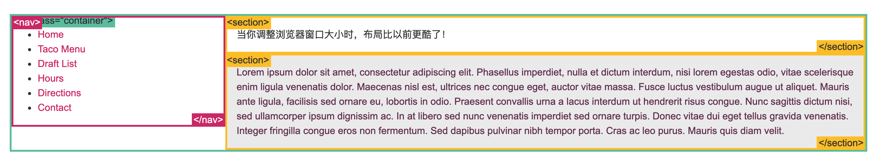
浮动布局例子
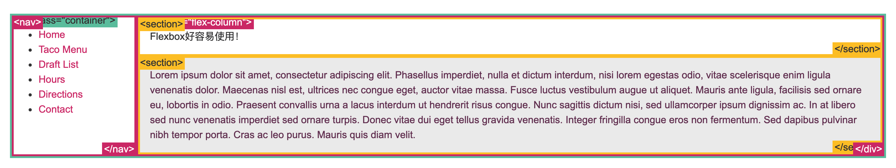
完全使用 float 来实现页面的布局是很常见的。这里有一个我之前用 position 实现的布局例子,这次我使用 float 实现了它。
1 | nav { |
百分比宽度
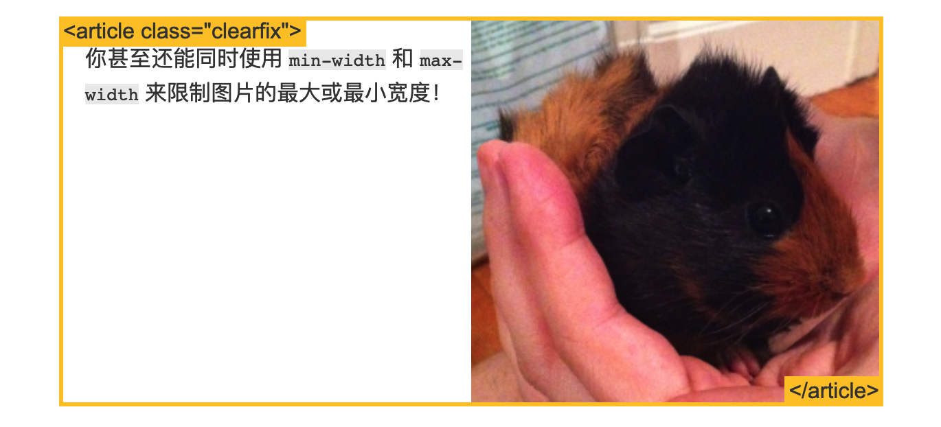
百分比是一种相对于包含块的计量单位。它对图片很有用:如下我们实现了图片宽度始终是容器宽度的50%。把页面缩小看下效果!
1 | article img { |
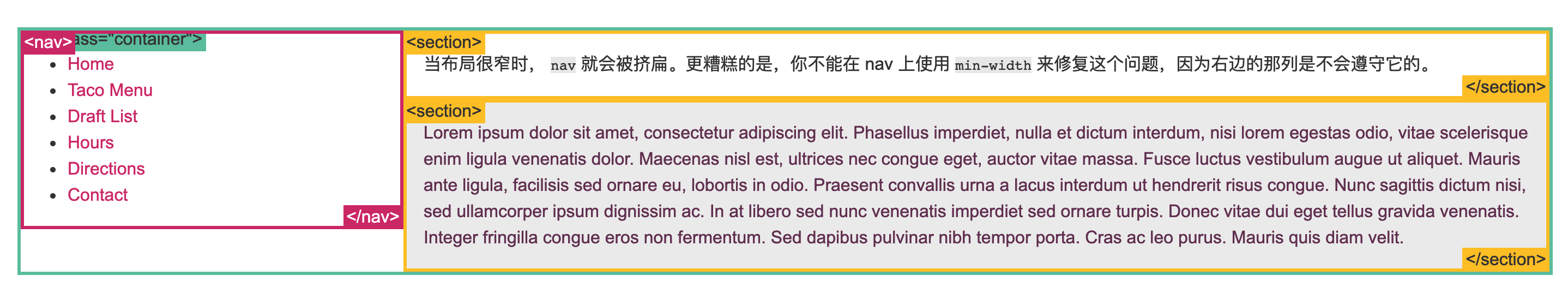
百分比宽度布局
你可以用百分比做布局,但是这需要更多的工作。在下面的例子中,当窗口宽度很窄时 nav 的内容会以一种不太友好的方式被包裹起来。总而言之,选一种最合适你的内容的方式。
1 | nav { |
媒体查询
- “响应式设计(Responsive Design” 是一种让网站针对不同的浏览器和设备“呈现”不同显示效果的策略,这样可以让网站在任何情况下显示的很棒!
- 媒体查询是做此事所需的最强大的工具。让我们使用百分比宽度来布局,然后在浏览器变窄到无法容纳侧边栏中的菜单时,把布局显示成一列:
1 | @media screen and (min-width:600px) { |
inline-block
你可以创建很多网格来铺满浏览器。在过去很长的一段时间内使用 float 是一种选择,但是使用 inline-block 会更简单。让我们看下使用这两种方法的例子:
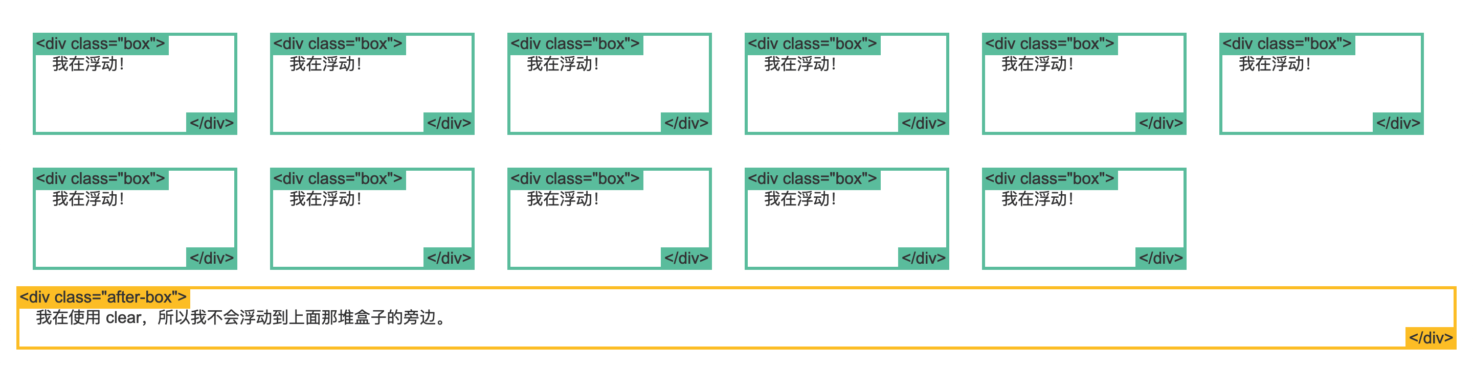
困难的方式(使用浮动)
1 | .box { |
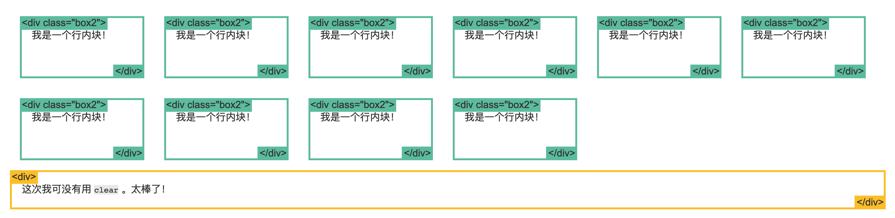
容易的方式(使用 inline-block)
你可以用 display 属性的值 inline-block 来实现相同效果。
1 | .box2 { |
inline-block 布局
你可以使用 inline-block 来布局。有一些事情需要你牢记:
vertical-align属性会影响到inline-block元素,你可能会把它的值设置为top。- 你需要设置每一列的宽度
- 如果HTML源代码中元素之间有空格,那么列与列之间会产生空隙
1 | nav { |
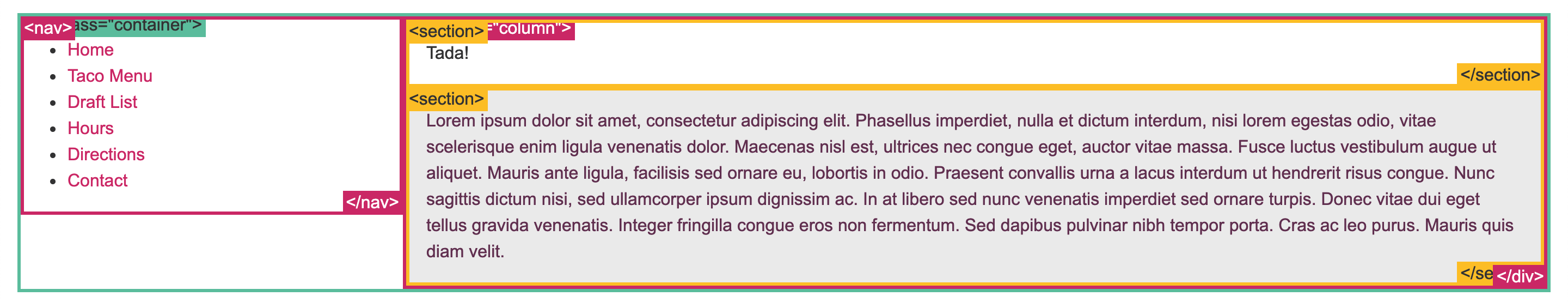
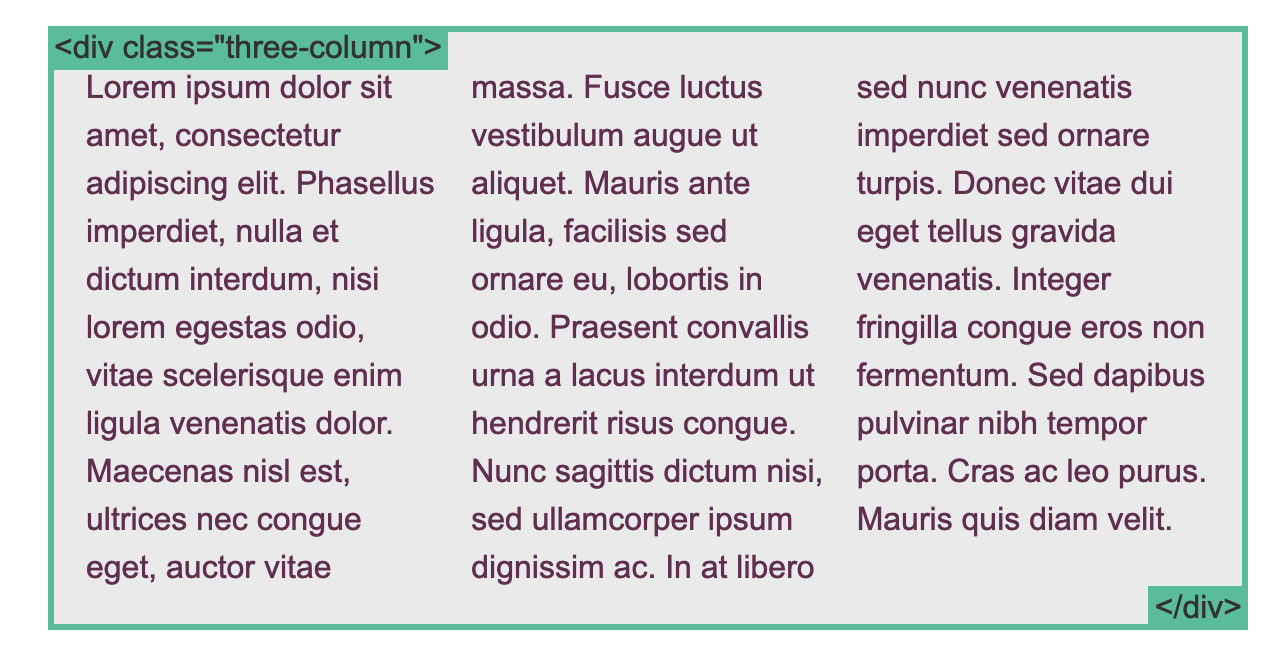
column
这里有一系列新的CSS属性,可以帮助你很轻松的实现文字的多列布局。让我们瞧瞧:
1 | .three-column { |
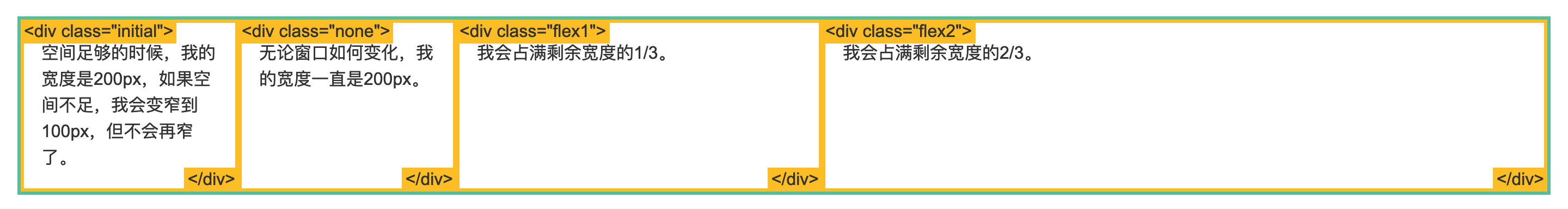
flexbox
使用 Flexbox 的简单布局
1 | .container { |
使用 Flexbox 的牛逼布局
1 | .container { |
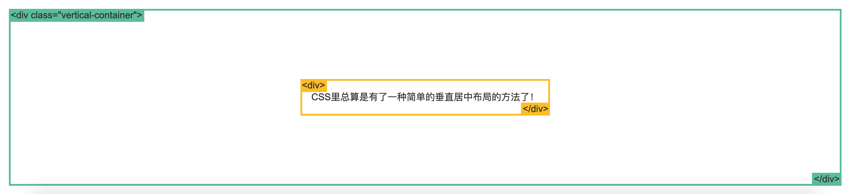
使用 Flexbox 的居中布局
1 | .vertical-container { |