第9章 绘图和可视化
信息可视化(也叫绘图)是数据分析中最重要的⼯作之⼀。matplotlib是⼀个⽤于创建出版质量图表的桌⾯绘图包。
matplotlib⽀持各种操作系统上许多不同的GUI后端,⽽且还能将图⽚导出为各种常⻅的⽮量(vector)和光栅(raster)图:PDF、SVG、JPG、PNG、BMP、GIF等。
9.1 matplotlib API⼊⻔
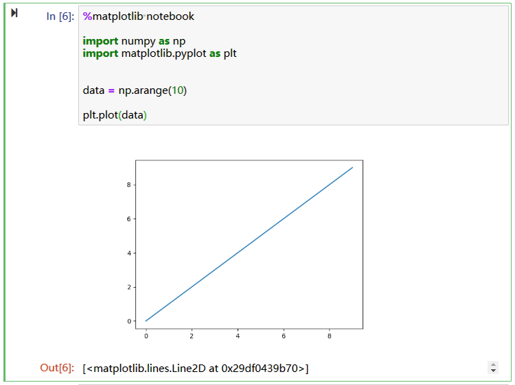
如果要在Jupyter notebook或ipython使用matplotlib,需要先做出声明:(matplotlib对Jupyter notebook和ipython做了接口优化)
1 | # Jupyter notebook |
声明之后还需要导入matplotlib,matplotlib的通常引⼊约定是:
1 | import matplotlib.pyplot as plt |
在Jupyter notebook输入
1 | %matplotlib notebook |
Figure和Subplot
matplotlib的图像都位于Figure对象中。
使用plt.figure创建⼀个新的Figure:
1 | import pandas as pd |
注意:
matplotlib就会在最后⼀个⽤过的subplot上进⾏绘制.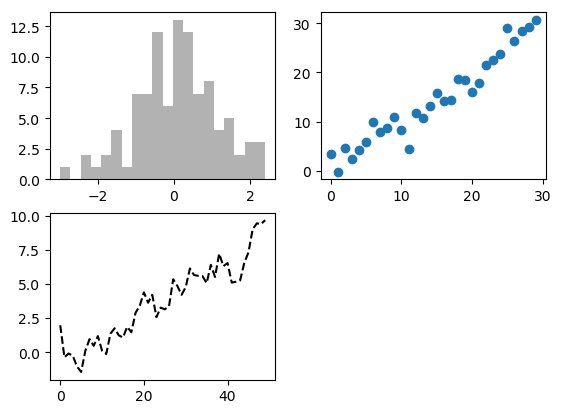
matplotlib中的作图线的属性及设置方式
颜色(color 简写为 c):
- 蓝色: ‘b’ (blue)
- 绿色: ‘g’ (green)
- 红色: ‘r’ (red)
- 蓝绿色(墨绿色): ‘c’ (cyan)
- 红紫色(洋红): ‘m’ (magenta)
- 黄色: ‘y’ (yellow)
- 黑色: ‘k’ (black)
- 白色: ‘w’ (white)
- 灰度表示: e.g. 0.75 ([0,1]内任意浮点数)
- RGB表示法: e.g. ‘#2F4F4F’ 或 (0.18, 0.31, 0.31)
- 任意合法的html中的颜色表示: e.g. ‘red’, ‘darkslategray’
线型(linestyle 简写为 ls):
- 实线: ‘-‘
- 虚线: ‘–’
- 点画线: ‘-.’
- 点线: ‘:’
- 点: ‘.’
图形标记(标记marker):
- 圆形: ‘o’
- 加号: ‘+’
- 叉形: ‘x’
- 星型: ‘*’
- 方形: ‘s’
图像标记、线宽及透明度:
- 标记大小:markersize 简写为 ms
- 标记表面(内部)颜色:markerfacecolor 简写为 mfc
- 标记边缘宽度:markeredgewidth 简写为 mew
- 标记边缘颜色:markeredgecolor 简写为 mec
- 线宽:linewidth
- 透明度:alpha,[0,1]之间的浮点数
设置线的属性的几种方式:
1
2
3
4
5
6
7
8# 1.直接在plt.plot()中使用'line properties'
plt.plot(x, y, 'r--') # 颜色线型总是组合在一起
# 2.运用关键字参数
plt.plot(x, y, markersize=15, marker='d', markerfacecolor='g')
# 3.混合使用1 和 2
plt.plot(x, y, 'r--', markersize=15, marker='d', markerfacecolor='g', linewidth=2)注意:颜色,线型,图形标记总是组合在一起:
1
plt.plot(x, y, 'ro--')
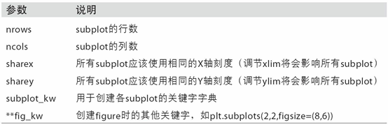
上面创建子图的方法太麻烦了,可以使用plt.subplots(2, 3):
1 | import numpy as np |
pyplot.subplots的选项:
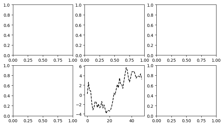
调整subplot周围的间距
默认情况下,matplotlib会在subplot外围留下⼀定的边距,并在subplot之间留下⼀定的间距。
利⽤Figure的subplots_adjust方法修改间距:
1 | subplots_adjust(left=None, bottom=None, right=None, top=None, |
wspace和hspace⽤于控制宽度和高度的百分⽐,可以⽤作subplot之间的间距。
1 | import numpy as np |
颜⾊、标记和线型
1 | import numpy as np |
基础设置:
与 MATLAB 类似,使用
axis函数指定坐标轴显示的范围:1
plt.axis([xmin, xmax, ymin, ymax])
使用 plt.plot() 的返回值来设置线条属性:
plot函数返回一个Line2D对象组成的列表,每个对象代表输入的一对组合:1
2
3
4
5
6
7
8
9
10
11import numpy as np
import matplotlib.pyplot as plt
# 加逗号 line 中得到的是 line2D 对象,不加逗号得到的是只有一个 line2D 对象的列表
line, = plt.plot(np.random.randn(50).cumsum(), 'r--')
# 将抗锯齿关闭
line.set_antialiased(False)
plt.show()plt.setp() 修改线条性质:
1
2
3
4
5
6
7
8
9
10
11
12
13
14import numpy as np
import matplotlib.pyplot as plt
# 加逗号 line 中得到的是 line2D 对象,不加逗号得到的是只有一个 line2D 对象的列表
lines = plt.plot(np.random.randn(50).cumsum())
# 使用键值对
plt.setp(lines, color='r', linewidth=2.0)
# 或者使用 MATLAB 风格的字符串对
plt.setp(lines, 'color', 'r', 'linewidth', 2.0)
plt.show()plt.setp(lines)的全部属性:
1
2
3
4
5
6
7
8
9
10
11
12
13
14
15
16
17
18
19
20
21
22
23
24
25
26
27
28
29
30
31
32
33
34
35
36
37
38
39
40
41
42
43
agg_filter: unknown
alpha: float (0.0 transparent through 1.0 opaque)
animated: [True | False]
antialiased or aa: [True | False]
axes: an :class:`~matplotlib.axes.Axes` instance
clip_box: a :class:`matplotlib.transforms.Bbox` instance
clip_on: [True | False]
clip_path: [ (:class:`~matplotlib.path.Path`, :class:`~matplotlib.transforms.Transform`) | :class:`~matplotlib.patches.Patch` | None ]
color or c: any matplotlib color
contains: a callable function
dash_capstyle: ['butt' | 'round' | 'projecting']
dash_joinstyle: ['miter' | 'round' | 'bevel']
dashes: sequence of on/off ink in points
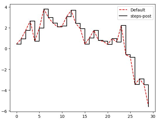
drawstyle: ['default' | 'steps' | 'steps-pre' | 'steps-mid' | 'steps-post']
figure: a :class:`matplotlib.figure.Figure` instance
fillstyle: ['full' | 'left' | 'right' | 'bottom' | 'top' | 'none']
gid: an id string
label: string or anything printable with '%s' conversion.
linestyle or ls: [``'-'`` | ``'--'`` | ``'-.'`` | ``':'`` | ``'None'`` | ``' '`` | ``''``]
linewidth or lw: float value in points
lod: [True | False]
marker: :mod:`A valid marker style <matplotlib.markers>`
markeredgecolor or mec: any matplotlib color
markeredgewidth or mew: float value in points
markerfacecolor or mfc: any matplotlib color
markerfacecoloralt or mfcalt: any matplotlib color
markersize or ms: float
markevery: [None | int | length-2 tuple of int | slice | list/array of int | float | length-2 tuple of float]
path_effects: unknown
picker: float distance in points or callable pick function ``fn(artist, event)``
pickradius: float distance in points
rasterized: [True | False | None]
sketch_params: unknown
snap: unknown
solid_capstyle: ['butt' | 'round' | 'projecting']
solid_joinstyle: ['miter' | 'round' | 'bevel']
transform: a :class:`matplotlib.transforms.Transform` instance
url: a url string
visible: [True | False]
xdata: 1D array
ydata: 1D array
zorder: any number图形上加上文字:
xlabel:x 轴标注ylabel:y 轴标注title:图形标题text:在指定位置放入文字annotate:注释xy参数 :注释位置xytext参数 :注释文字位置
1
2
3
4
5
6
7
8
9
10
11
12
13
14
15
16
17
18
19
20
21
22
23
24
25
26
27import numpy as np
import matplotlib.pyplot as plt
mu, sigma = 100, 15
x = mu + sigma * np.random.randn(10000)
# the histogram of the data
n, bins, patches = plt.hist(x, 50, normed=1, facecolor='g', alpha=0.75)
# x轴标签名
plt.xlabel('Smarts')
plt.ylabel('Probability')
# 图形标题
plt.title('Histogram of IQ')
# 在指定位置放入文字
# 如果要输入特殊符号,需要使用Tex语法
plt.text(60, .025, r'$\mu=100,\ \sigma=15$')
plt.axis([40, 160, 0, 0.03])
# 是否显示网格
plt.grid(True)
plt.show()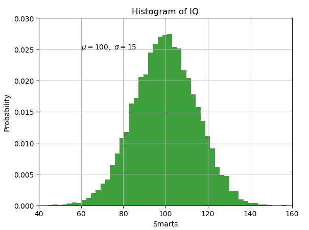
刻度、标签和图例
对于⼤多数的图表装饰项,其主要实现⽅式有⼆:
- 使⽤过程型的pyplot接⼝(例如,matplotlib.pyplot)
- 更为⾯向对象的原生matplotlib API。
pyplot接口的设计⽬的就是交互式使⽤:
- xlim⽅法:
控制图表的范围 - xticks⽅法:
控制刻度位置 - xticklabels⽅法:
控制刻度标签
使⽤⽅式:
- 调⽤时不带参数,则返回当前的参数值
(例如,plt.xlim()返回当前的X轴绘图范围)。 - 调⽤时带参数,则设置参数值
(例如,plt.xlim([0,10])会将X轴的范围设置为0到10)。
所有这些⽅法都是AxesSubplot起作⽤的。
它们各⾃对应subplot对象上的两个⽅法,以xlim为例,就是ax.get_xlim和ax.set_xlim。
设置标题、轴标签、刻度以及刻度标签
1 | import numpy as np |
要是嫌上面的代码太繁琐,可以直接使用set函数:
1 | fig = plt.figure() |
添加图例
1 | import numpy as np |
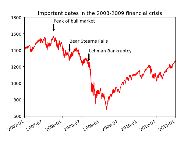
注解以及在Subplot上绘图
注解和⽂字可以通过text、arrow和annotate函数进⾏添加。text可以将⽂本绘制在图表的指定坐标(x,y),还可以加上⼀些⾃定义格式:
1 | ax.text(x, y, 'Hello world!',family='monospace', fontsize=10) |
ax.annotate⽅法:在指定的x和y坐标轴绘制标签。
1 | from datetime import datetime |
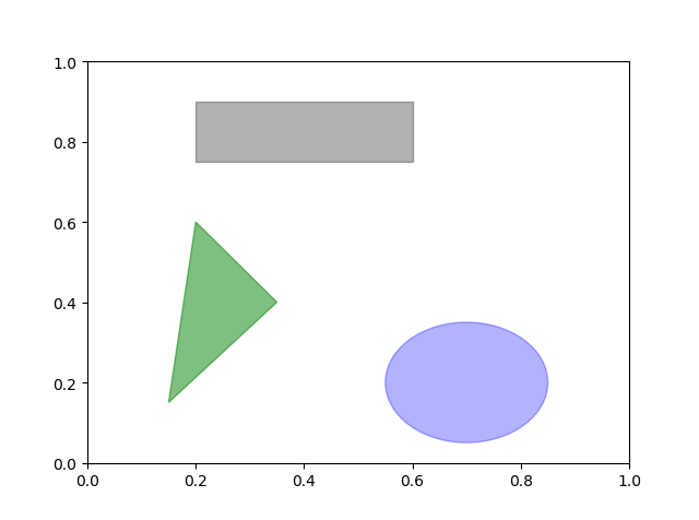
图形的绘制要麻烦⼀些。
matplotlib有⼀些表示常⻅图形的对象。这些对象被称为块(patch)。
要在图表中添加⼀个图形,你需要创建⼀个块对象shp,然后通过ax.add_patch(shp)将其添加到subplot中:
1 | import numpy as np |
将图表保存到⽂件
plt.savefig:将当前图表保存到⽂件。
1
2
3# dpi:“每英⼨点数”分辨率
# bbox_inches:剪除当前图表周围的空⽩部分
plt.savefig('figpath.png', dpi=400, bbox_inches='tight')Figure对象的实例⽅法savefig
savefig并⾮⼀定要写⼊磁盘,也可以写⼊任何⽂件型的对象,⽐如BytesIO:
1 | 
matplotlib配置
rc⽅法
- 第⼀个参数是希望⾃定义的对象,’figure’、’axes’、’xtick’、’ytick’、’grid’、’legend’等。
- 后面都是关键字参数.
所以可以使用字典传入
1 | # 将全局的图像默认⼤⼩设置为10×10,你可以执⾏ |
9.2 使⽤pandas和seaborn绘图
图表的基本组件:
- 数据展示:
图表类型:线型图、柱状图、盒形图、散布图、等值线图等 - 图例
- 标题
- 刻度标
- 注解型信息。
线型图:
默认创建的图形就是线性图
1 | import numpy as np |
- ==该Series对象的索引会被传给matplotlib,并⽤以绘制X轴。==可以通过use_index=False禁⽤该功能。
- X轴的刻度和界限通过xticks和xlim选项进⾏调节,Y轴就⽤yticks和ylim。
plot参数的完整列表:
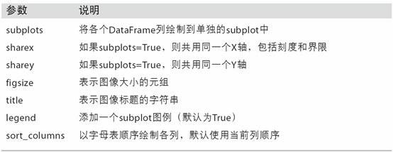
| 参数 | 说明 |
|---|---|
| label | 图例标签 |
| ax | 要在其上进行绘制的 matplotlib subplot对象。如果没有设置,则使用当前matplotlib subplot |
| style | 将要传给 matplotlib的风格字符串(如’ko–’) |
| alpha | 图表的填充不透明度(0到1之间) |
| kind | 可以是’line’、’bar‘、’barh、’kde’ |
| logy | 在Y轴上使用对数标尺 |
| use_index | 将对象的索引用作刻度标签 |
| rot | 旋转刻度标签(0到360) |
| xticks | 用作X轴刻度的值 |
| yticks | 用作Y轴刻度的值 |
| xlim | X轴的界限(例如[0,10]) |
| ylim | Y轴的界限 |
| grid | 显示轴网格线(默认打开) |
注意:
plot的关键字参数会被传给相应的matplotlib绘图函数,所以要更深⼊地⾃定义图表,就必须学习有关matplotlib API。
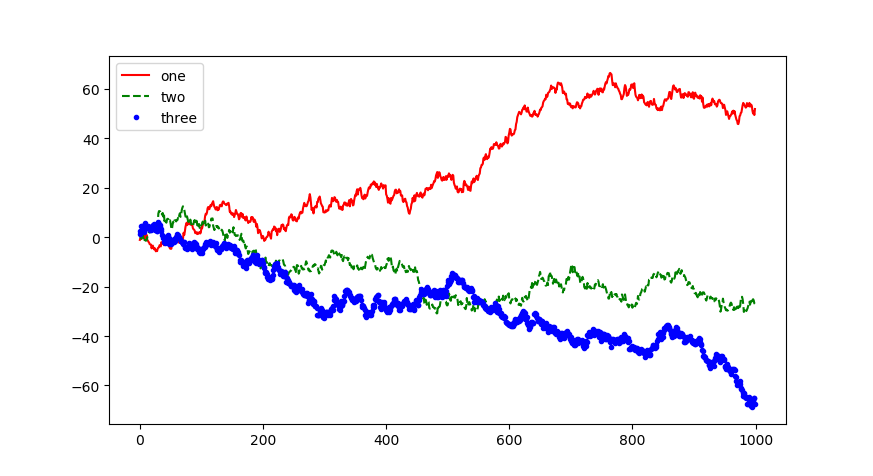
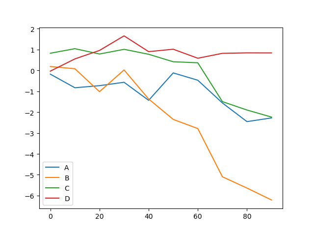
DataFrame的plot⽅法会在⼀个subplot中为各列绘制⼀条线,并⾃动创建图例
也就是说,==一个series就绘制一条线==
1 | import numpy as np |
专⽤于DataFrame的plot参数
柱状图
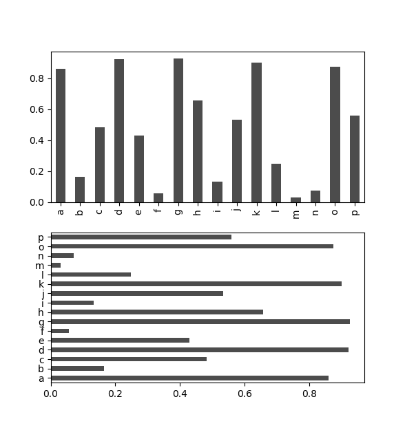
plot.bar()和plot.barh()分别绘制⽔平和垂直的柱状图.
这时,Series和DataFrame的索引将会被⽤作X(bar)或Y(barh)刻度
1 | import numpy as np |
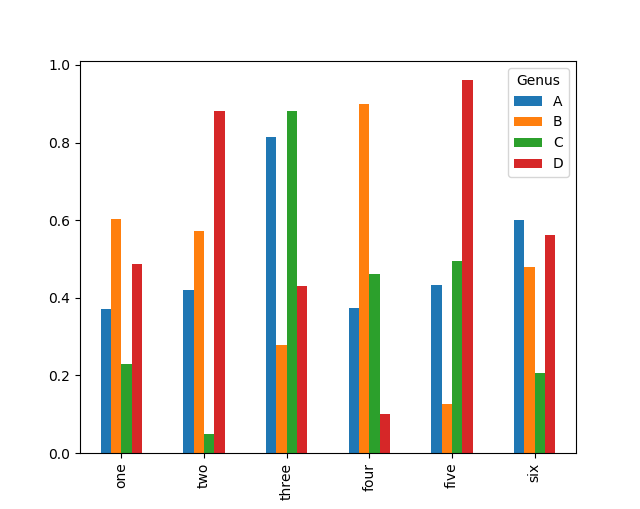
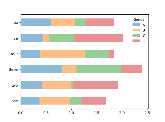
对于DataFrame,
- 柱状图会将每⼀列的值分为⼀组,并排显示
- DataFrame各列的名称”Genus”被⽤作了图例的标题
- 设置stacked=True即可为DataFrame⽣成堆积柱状图
1 | import numpy as np |
柱状图有⼀个⾮常不错的⽤法:利⽤value_counts图形化显示Series中各值的出现频率:
1 | 
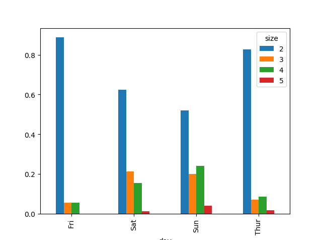
将柱状图堆积:df.plot.barh(stacked=True, alpha=0.5)
1 | import numpy as np |
做⼀张堆积柱状图以展示每天各种聚会规模的数据点的百分⽐。
1 | import numpy as np |
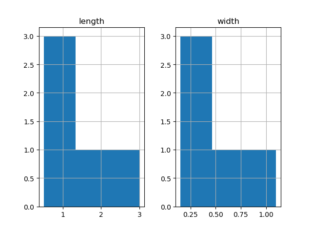
直⽅图和密度图
直⽅图:histogram.所以函数为hist
1 | import numpy as np |
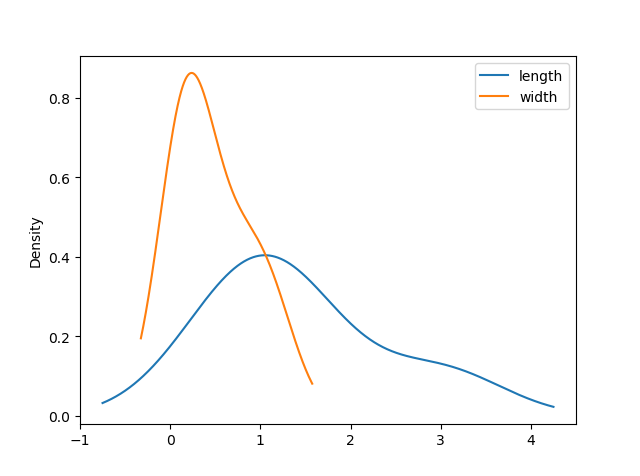
密度图也被称作KDE(Kernel Density Estimate,核密度估计)图。
所以密度图的函数就是density()
1 | import numpy as np |
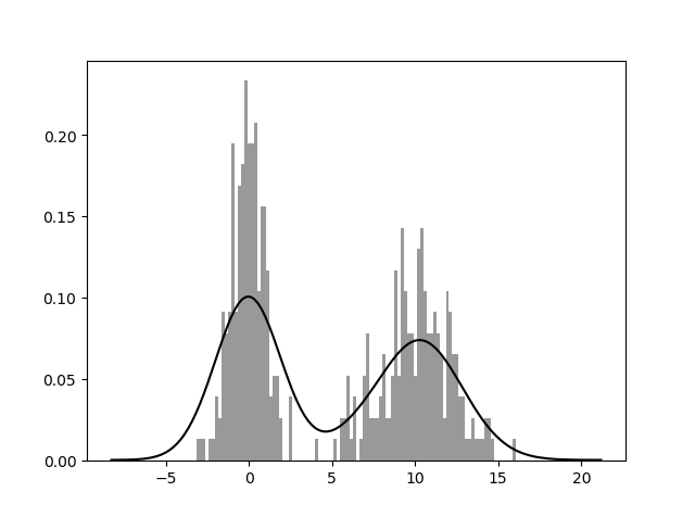
seaborn的distplot⽅法绘制直⽅图和密度图更加简单,还可以同时画出直⽅图和连续密度估计图。
实现⼀个双峰分布,由两个不同的标准正态分布组成:
1 | import numpy as np |
散布图或点图
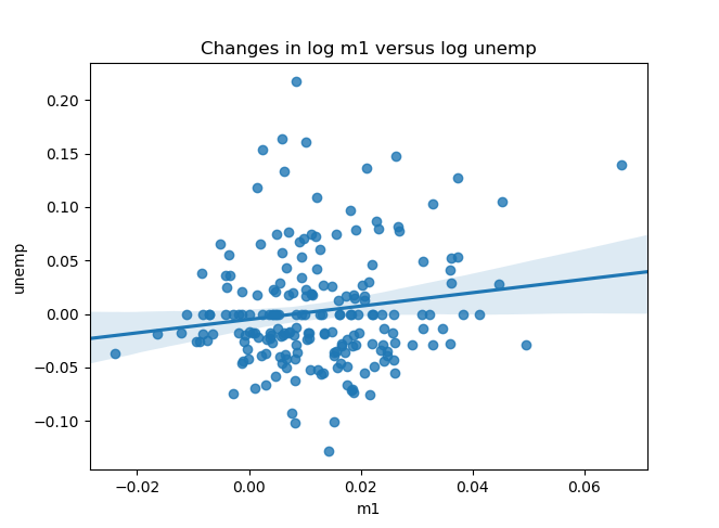
使⽤seaborn的regplot⽅法,它可以做⼀个散布图
1 | import numpy as np |
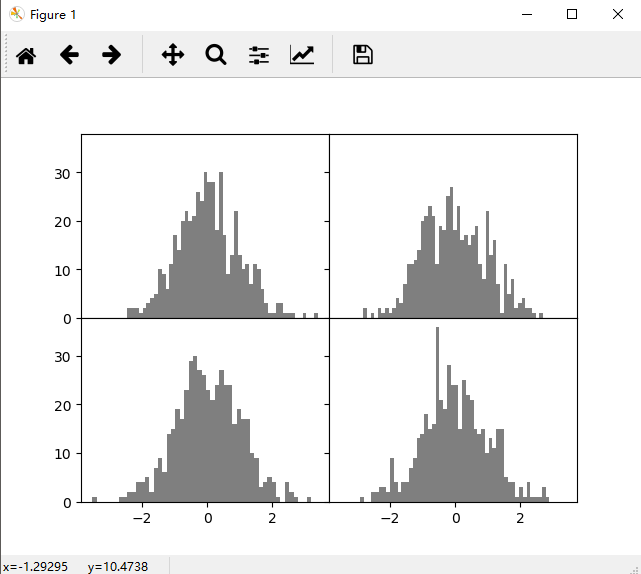
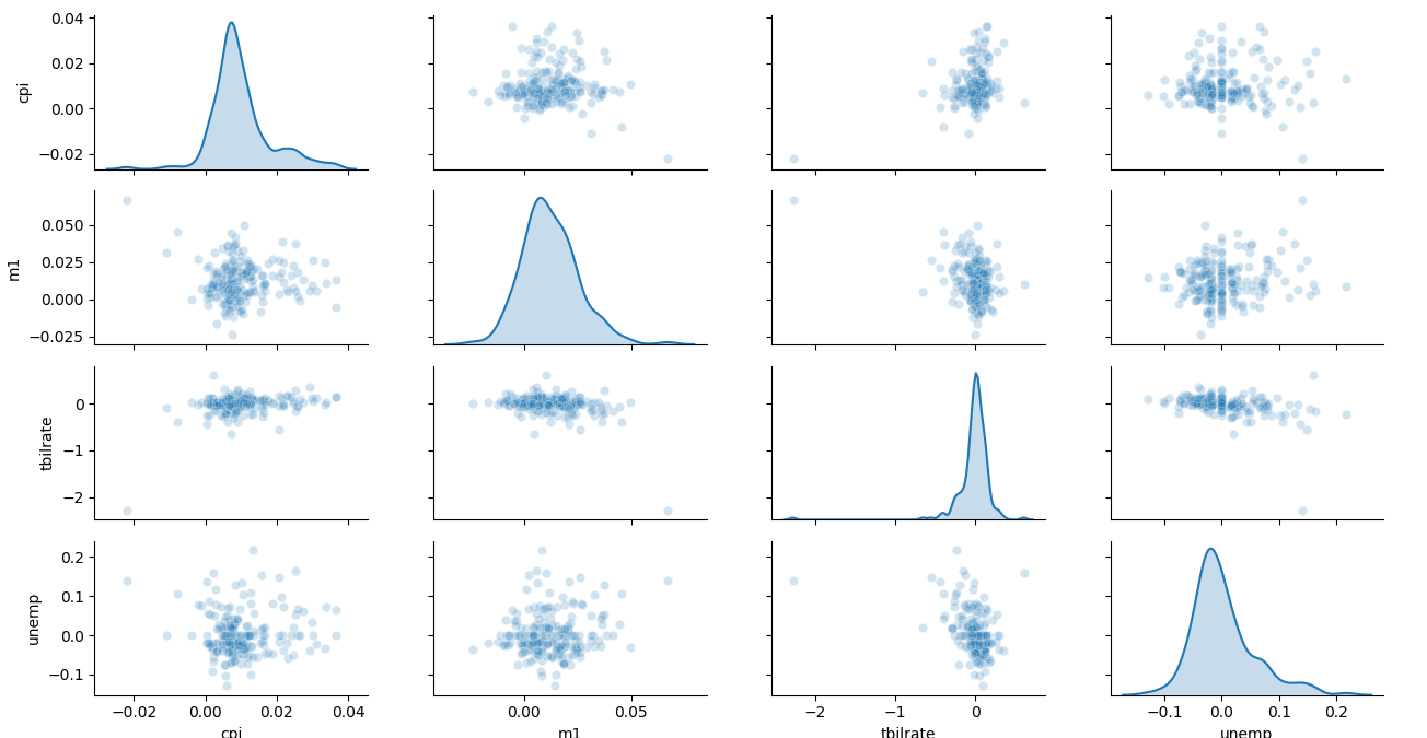
在探索式数据分析⼯作中,同时观察⼀组变量的散布图是很有意义的,这也被称为散布图矩阵(scatter plot matrix)。
这是要使用seaborn库的pairplot:
它⽀持在对⻆线上放置每个变量的直⽅图或密度估计
1 | import numpy as np |
分⾯⽹格(facet grid)和类型数据
有多个分类变量的数据可视化的⼀种⽅法是使⽤⼩⾯⽹格。seaborn有⼀个有⽤的内置函数factorplot,可以简化制作多种分⾯图
看不懂,略