HTML5新标签:
datalist:
1
2
3
4
5
6
7
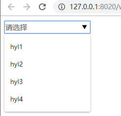
| <input type="text" list="data" placeholder="请选择" />
<datalist id='data'>
<option>hyl1</option>
<option>hyl2</option>
<option>hyl3</option>
<option>hyl4</option>
</datalist>
|
details:
1
2
3
4
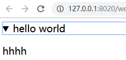
| <details>
<summary>hello world</summary>
<p>hhhh</p>
</details>
|
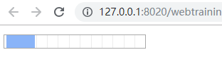
:progress:进度条
1
2
3
|
<progress max='100',value='20'></progress>
|
1
2
3
4
5
6
7
8
9
10
|
<progress id='pro' max='100',value='20'></progress>
<script type="text/javascript">
var num = 0;
setInterval(function(){
$('#pro').val(num+'')
num++
},100)
</script>
|
其余不谈
CSS3
伪类选择器:
first-line:
1
2
|
p:first-line{font-size:30px}
|
first-letter
1
2
|
p:first-letter{font-size:30px}
|
before/after:
1
2
3
4
|
p:before{
content:'哈苏打水大'
}
|
link
hover
active
not:不包含:
1
2
3
4
|
div:not(#box){
background-color:yellow
}
|
移动端布局:
1
2
3
4
5
6
7
8
9
10
11
12
13
14
15
16
17
18
19
20
21
22
23
24
25
26
27
28
29
30
31
32
33
34
35
36
37
38
39
40
41
42
43
44
45
46
47
48
49
50
51
52
53
54
55
56
57
58
59
60
61
62
63
64
65
66
67
68
69
70
71
72
73
74
75
76
77
78
79
80
81
82
83
84
85
86
87
88
89
90
91
92
| <!DOCTYPE html>
<html>
<head>
<meta charset="utf-8" />
<title>first web</title>
<script src="http://ajax.googleapis.com/ajax/libs/jquery/1.10.2/jquery.min.js"></script>
<meta name="viewport" content="width=device-width,initial-scale=1,minimum-scale=1,maximum-scale=1,user-scalable=no" />
<style type="text/css">
*{
padding: 0;
margin: 0;
}
nav{
height: 49px;
background-color: gainsboro;
position: fixed;
bottom: 0;
left: 0;
right: 0;
}
ul{
list-style: none;
display: flex;
}
nav ul li{
flex-grow: 1;
line-height: 49px;
text-align: center;
}
nav ul li a{
text-decoration: none;
font-size: 19px;
}
#box ul{
flex-wrap: wrap;
}
#box li{
display: flex;
border-bottom: 1px solid gray;
flex-direction: row;
flex-grow: 1;
}
#box li div:nth-of-type(1){
width: 100px;
height: 100px;
background-color: red;
}
#box li div:nth-of-type(2){
width: 200px;
height: 100px;
background-color: yellow;
flex-grow: 5;
}
</style>
</head>
<body>
<div id="box">
<ul>
<li>
<div id=""></div>
<div id=""></div>
</li>
<li>
<div id=""></div>
<div id=""></div>
</li>
<li>
<div id=""></div>
<div id=""></div>
</li>
</ul>
</div>
<nav>
<ul>
<li><a href="#">首页</a></li>
<li><a href="#">超市</a></li>
<li><a href="#">购物车</a></li>
<li><a href="#">我的</a></li>
</ul>
</nav>
</body>
</html>
|
上面代码字体的大小是写死的,不同的手机的观感差距大,这时就可以使用REM:
1
2
3
4
5
6
7
8
9
10
11
12
13
14
15
16
17
18
19
20
21
22
23
24
25
26
27
28
29
| <!DOCTYPE html>
<html>
<head>
<meta charset="UTF-8">
<title>red</title>
<style type="text/css">
html{
font-size: 12px;
}
p{
font-size: 2rem;
}
</style>
</head>
<body>
<div id="">
hello world
</div>
<p>hello world2</p>
</body>
<script type="text/javascript">
document.documentElement.style.fontSize = innerWidth
</script>
</html>
|
简单来说
使用帧动画:
1
2
3
4
5
6
7
8
9
10
11
12
13
14
15
16
17
18
19
20
21
22
23
24
25
26
27
28
29
30
31
32
33
34
35
36
37
38
| <!DOCTYPE html>
<html>
<head>
<meta charset="UTF-8">
<title>title</title>
<style type="text/css">
@keyframes mycolor{
0%{
background-color: yellow;
}
25%{
background-color: blue;
}
50%{
background-color: pink;
}
100%{
background-color: green;
}
}
div{
width: 100px;
height: 100px;
}
div:hover{
animation: mycolor 6s linear 0s;
}
</style>
</head>
<body>
<div id="">
hyl
</div>
</body>
</html>
|
动画:
- transform:
CSS3中的形变处理,实现文字和图像的旋转,缩放,倾斜和移动等.
- transitions:
CSS3中动画功能,通过一个属性值平滑够毒到另一个属性值来实现
- animation:
CSS3中的动画功能,通过在样式中创建多个关键帧,在这些关键帧中编写样式,并且能够在页面上综合运行这些关键帧来实现较为复杂的动画.